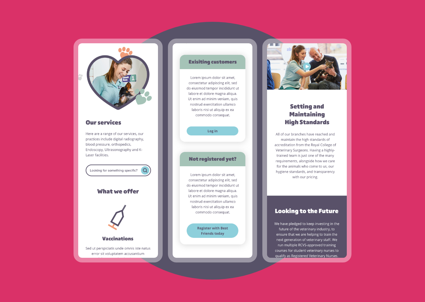
During my time at Quba, I got to work on the Best Friends vet group website. Coming in at the start of the project, we were not only looking to evolve their brand online but transform their brand as a whole.
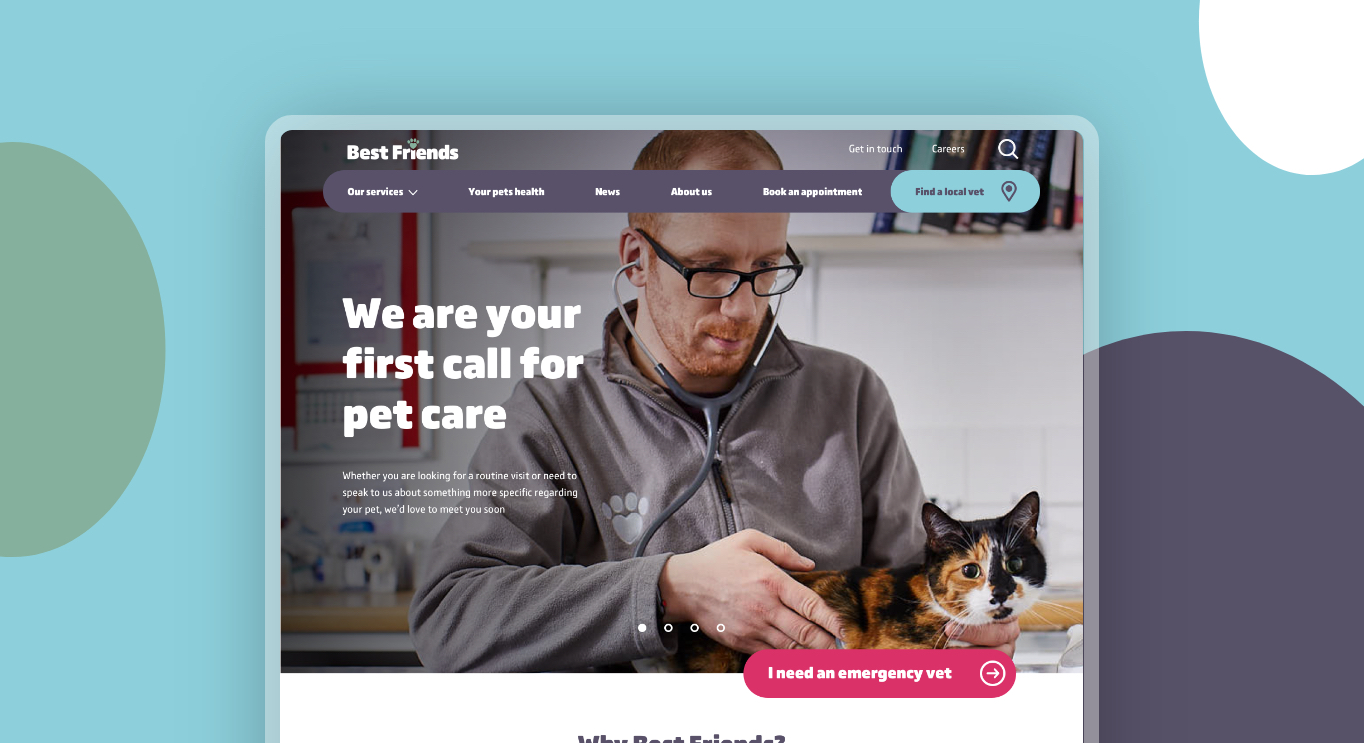
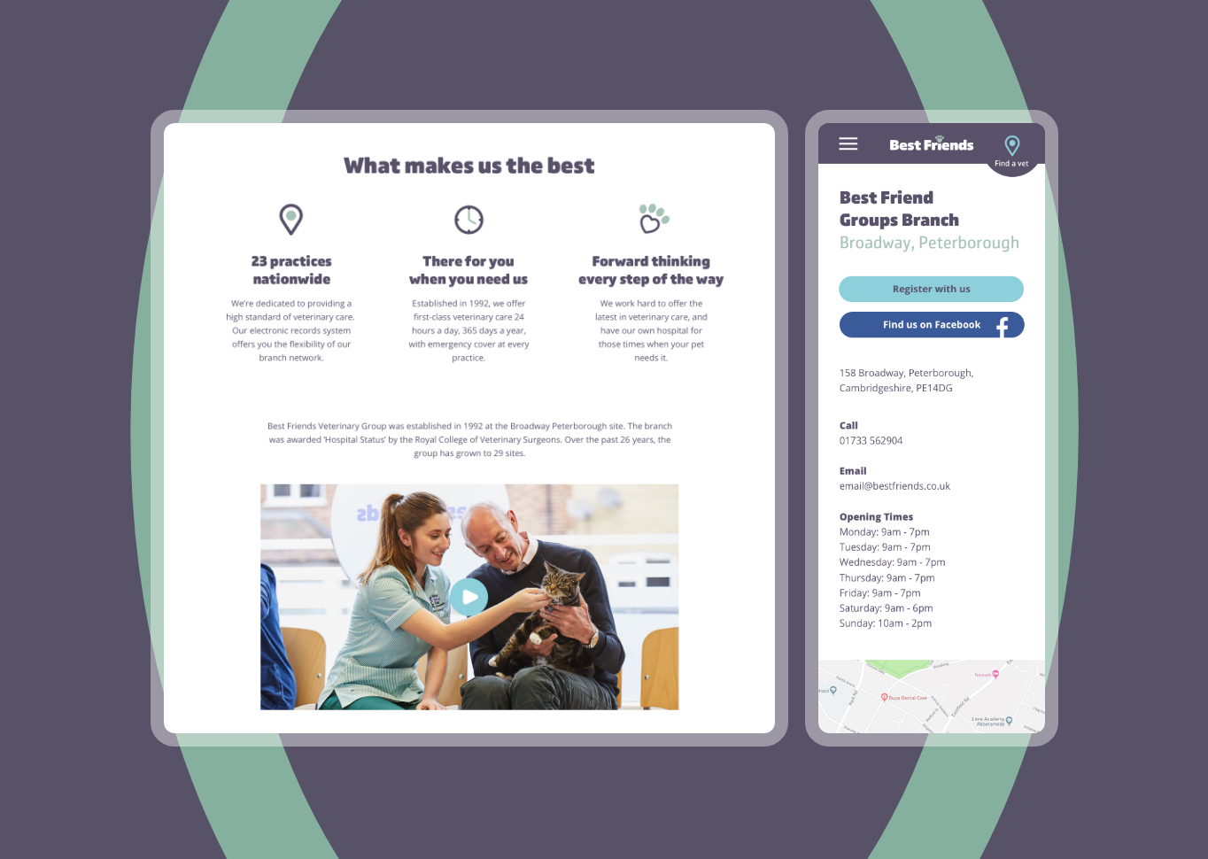
One of the main focuses on the UX side was getting the selling point of Best Friends across to users. Friendly imagery and the video was used through the site to show this along with an easy way to locate your nearest surgery.
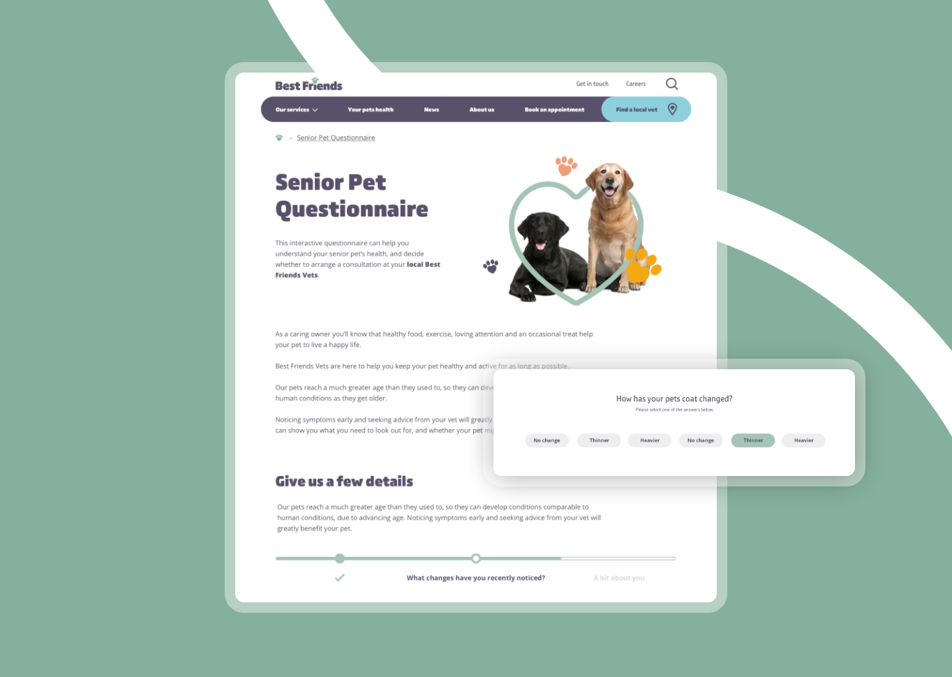
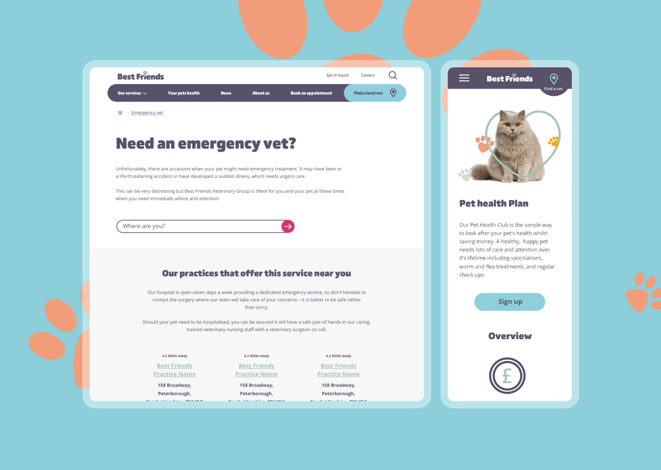
We used isolated images mixed with paw prints for page banners. It opened up the pages and gave them a friendly yet clinical aesthetic. Developing extra assets such as Icons, image style and banners to make sure their site has the tools needs to with over new visitors and separate them from the market.
