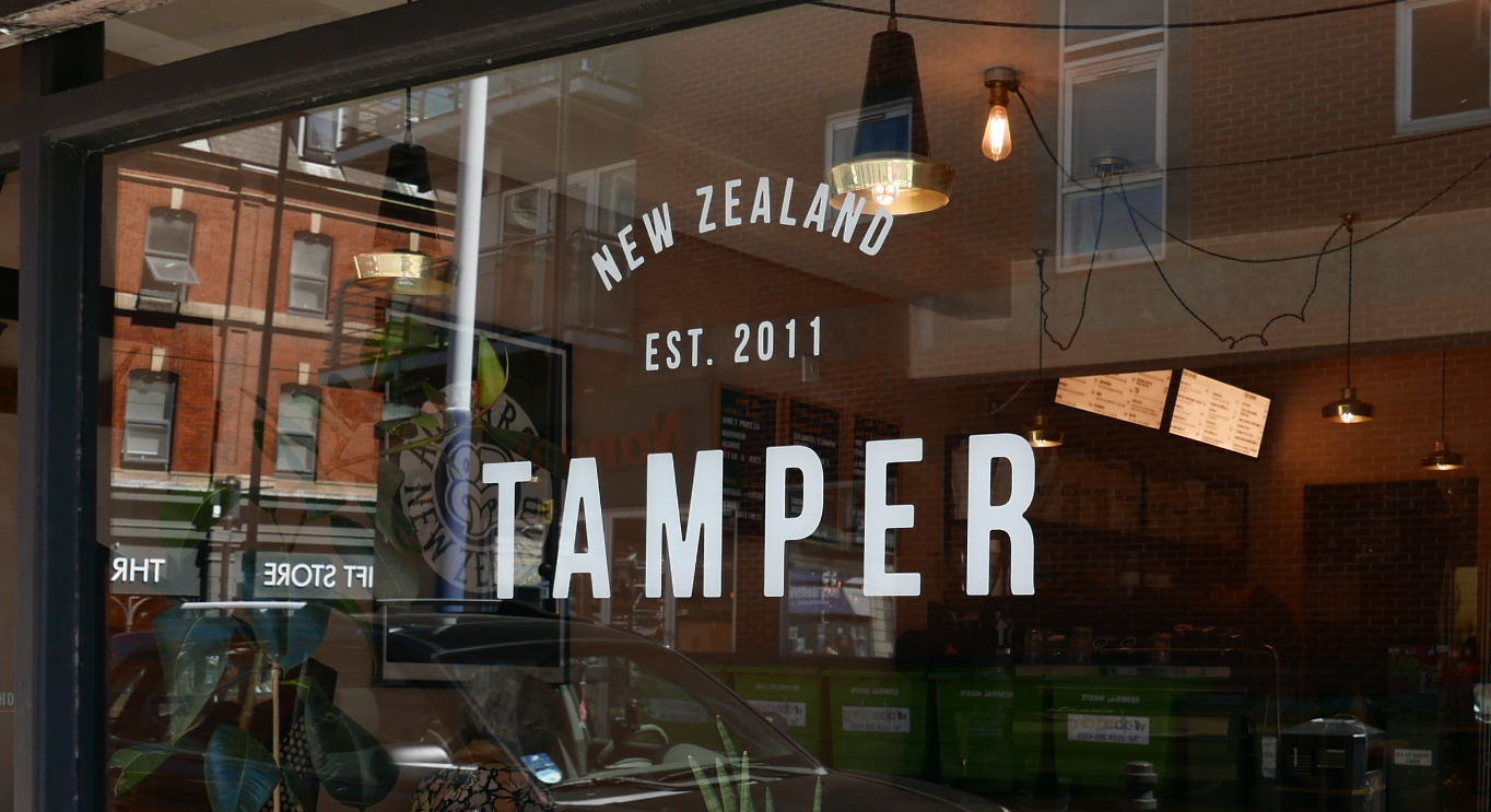
Tamper Coffee is one of Sheffield's top independent coffee outlets and a staple in the city. Established in 2011, they have built a reputation as a cool, kiwi inspired hangout. My first encounter with Tamper Coffee was in 2017 when I was asked to redesign their outdated logo.
The goal was to create a new identity that reflected their status and relaxed vibe. As the hadn’t had a rebrand before, it was important that I designed something long-lasting and flexible to their current and future business needs.
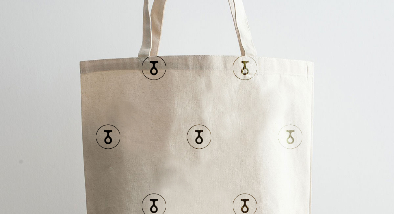
The main issue was the lack of a type-driven logo. We worked on making the stamp the secondary part logo and focused on a bold typeface for their main signage. The stamp became the mark for printed collateral and merchandise.


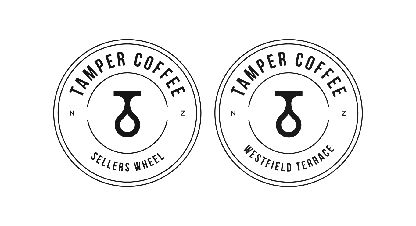
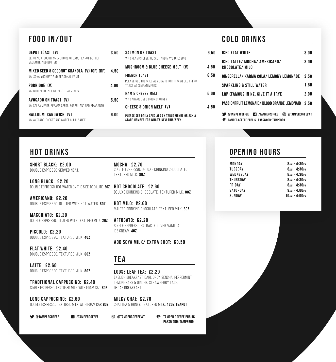
They currently have three sites so it was vital that the brand was instantly recognisable and able to work at all locations to give customers a sense of familiarity. The rebrand consisted not only of the logo but of merchandise and menus, amongst other elements.
The stamp is tailored to them specifically: the main circular outline mimics the top of a coffee cup, the teardrop represents one of the other key ingredients in coffee, water and the T not only stands for their name but also the origin of their name, a coffee tamper. The inspiration for the flipped the tamper came from the original logo.

With the owners being from New Zealand, we worked on general NZ sayings presented in a calligraphy font for a more playful look for merchandise.
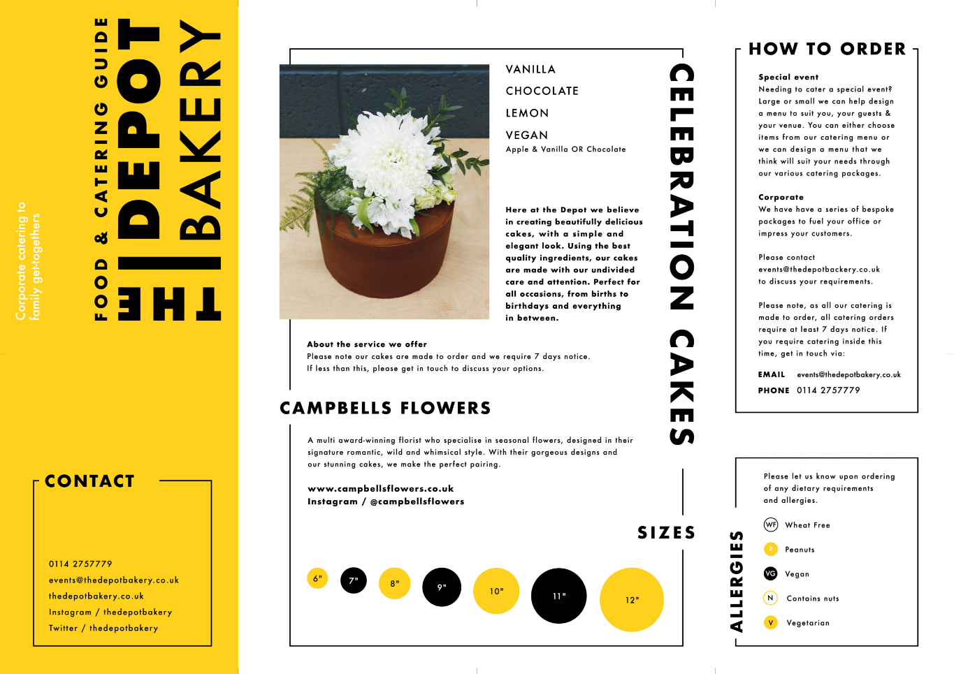
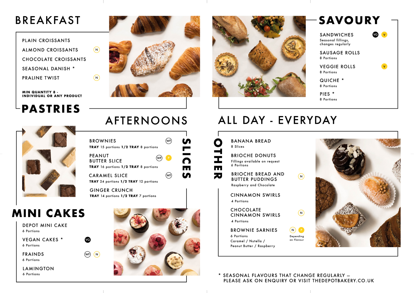
The Depot Bakery, also based in Sheffield, is a sub-brand of Tamper Coffee and a well-regarded artisan cafe/ bakery within its own rights. I worked closely with them to design a leaflet informing customers of their services for catering events. Along with the overall design, I gave creative direction for photography and helped with the printing.