Tenacity is an IT company based in Sheffield UK and aims to provide IT services for medium to large-sized business. I was asked to help in creating their brand along with the website design and build. We went through multiple different branding iterations until we found the perfect fit.
With offices in Tinsley Sheffield and Hathersage, Tenacity is an IT company built off over 20 years of experience in the Dental IT sector. Their sister company Dental IT has been going for years, so this isn't a standard run of the mill branding project. It needed to represent that level of expertise that comes with a company with that sort of background.
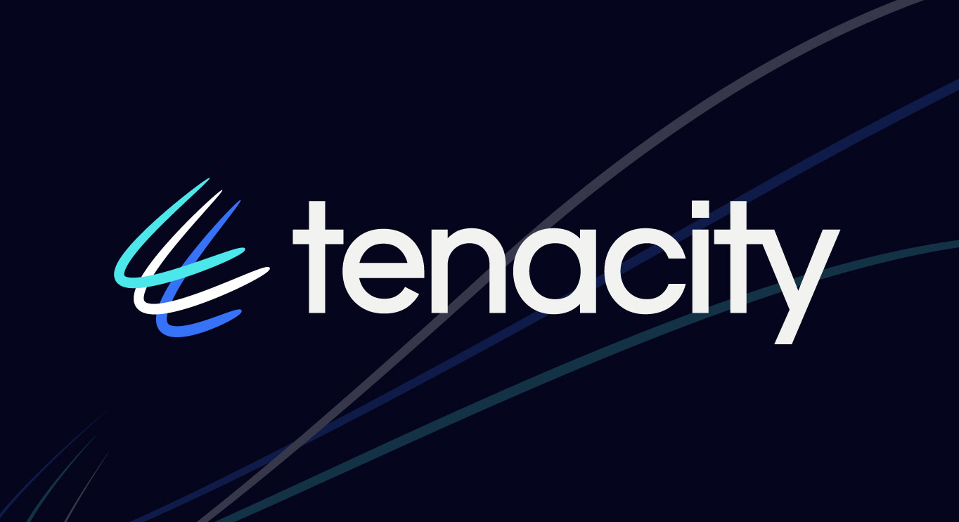
Our first direction saw us go down the more fast passed, technical route. The brand mark represented the fast connection and also a movement that pushed forward and into new boundaries. The lower case type also gave it a more approachable look and feel. However, after sitting with it for some time, we decided Tenacity wasn't about this look and feel, it lost the heritage behind the name, so a new direction was needed.
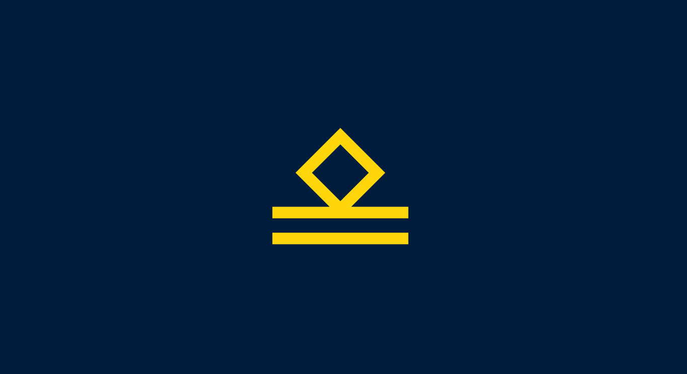
On a personal level, the name Tenacity comes from the name of a ship, a tug-boat, commanded by Liam's (The Tenacity owner) grandad Lieutenant McNaughton, awarded an MBE in 1943 for his "zeal and wholehearted devotion to duty", including the rescue of the US ship "Campbell" whilst operating in an area threatened by German U-boats. We wanted to bring this history into the brand mark. Above is the symbol that Liam's grandad proudly wore on his uniform, so this was the base of our new direction and identity.
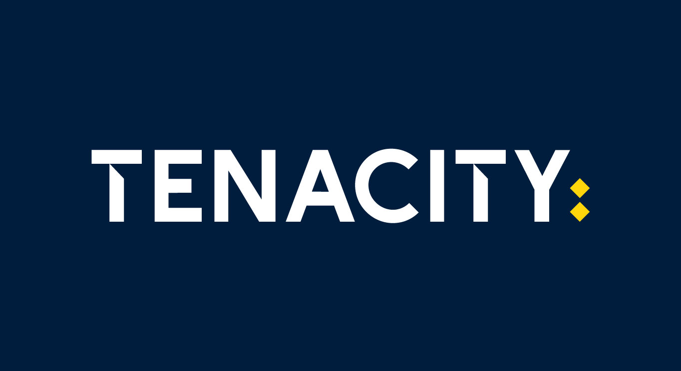
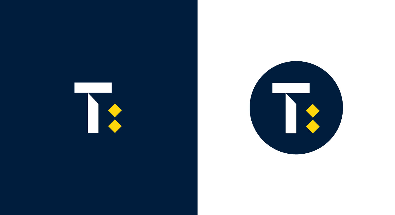
After some sketching, designs and more sketching, we had found our winning design. The yellow diamonds at the end give a nod to the naval story of the name while also linking in as a colon often seen with IT codes. The type pace also lends itself well to the angles seen on the diamonds and creates a lovely cohesive identity when joined together.
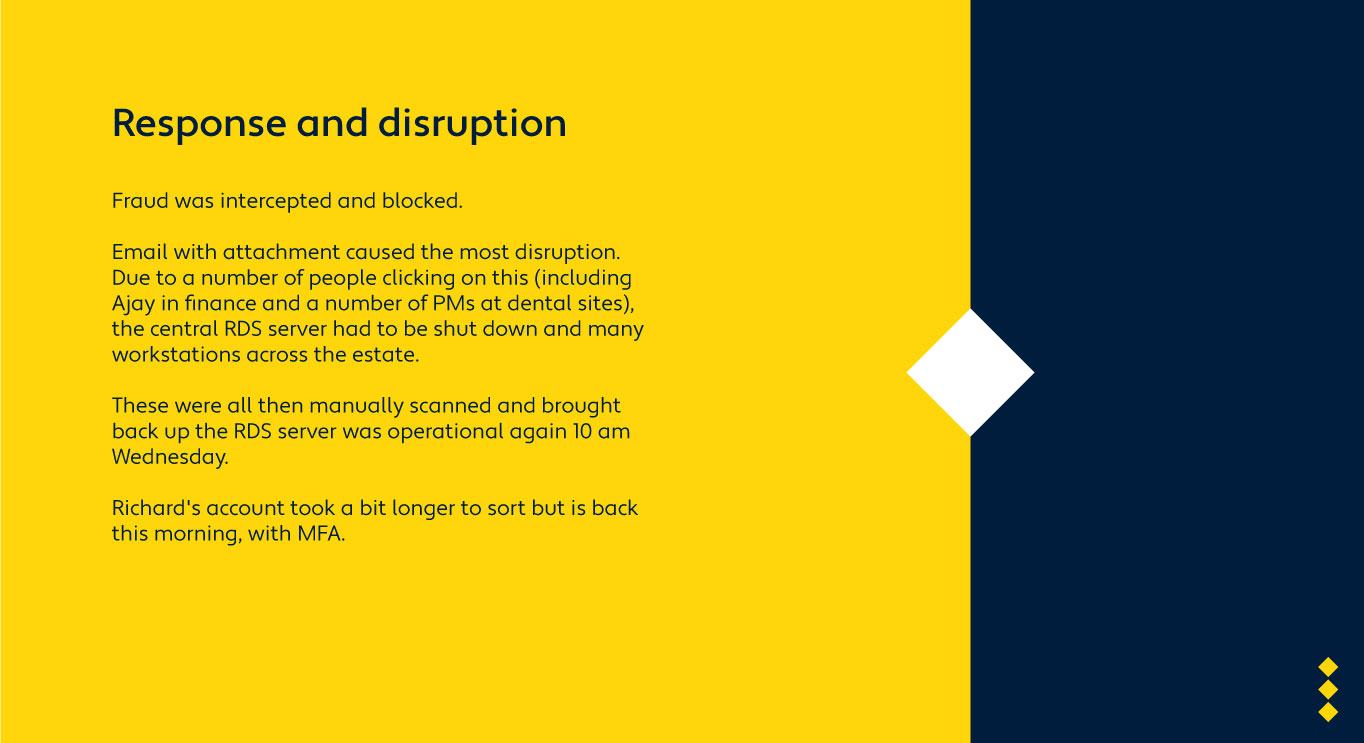
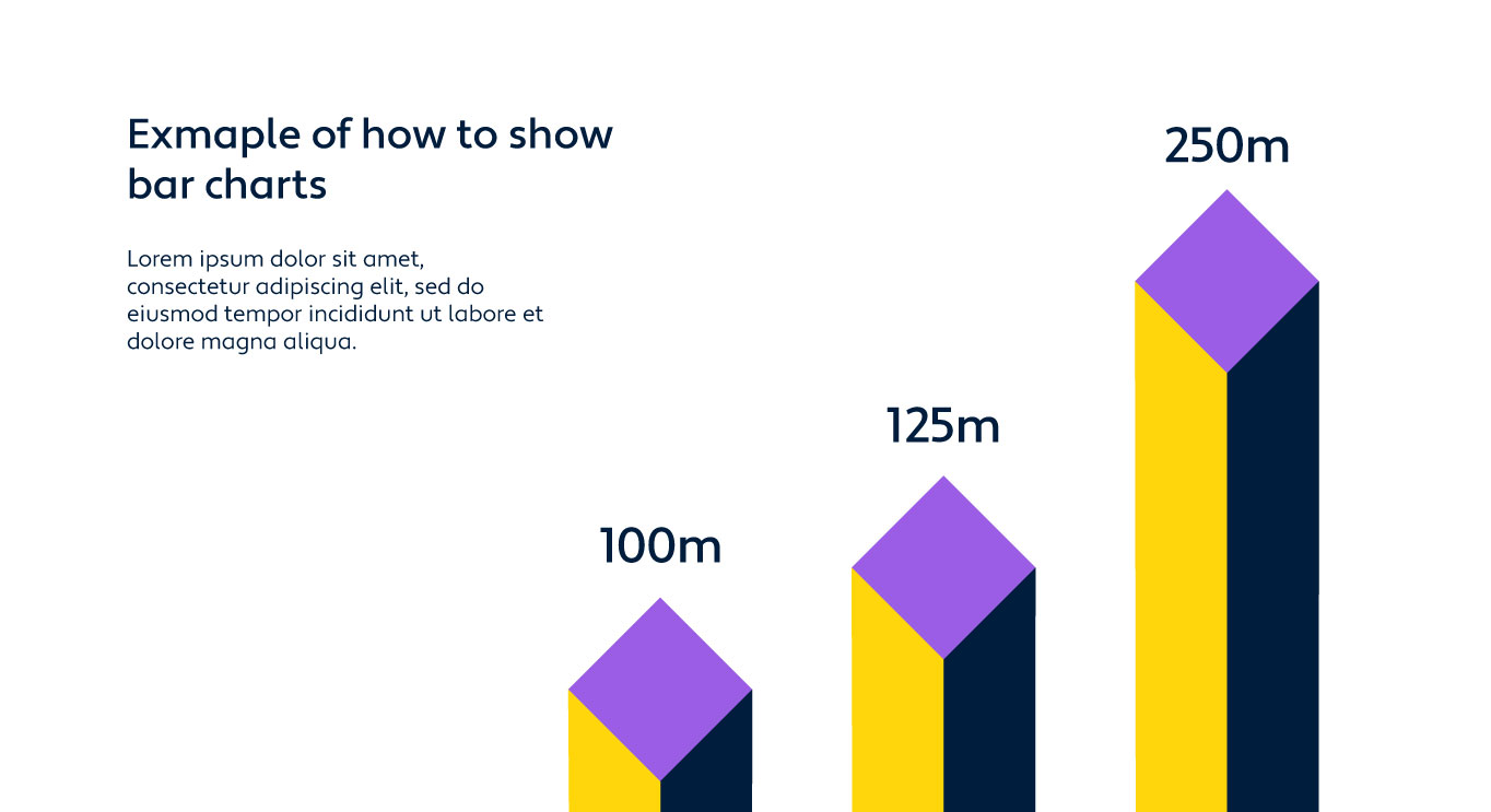
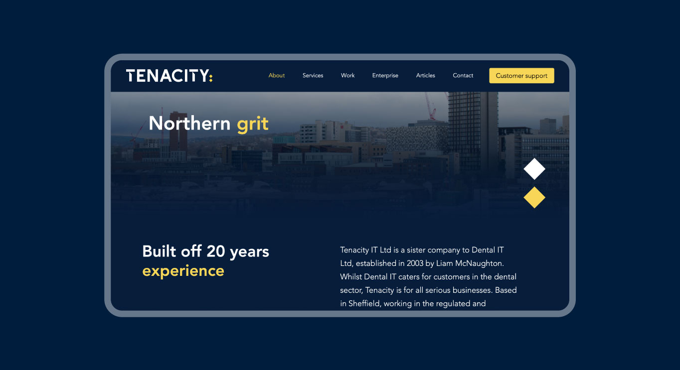
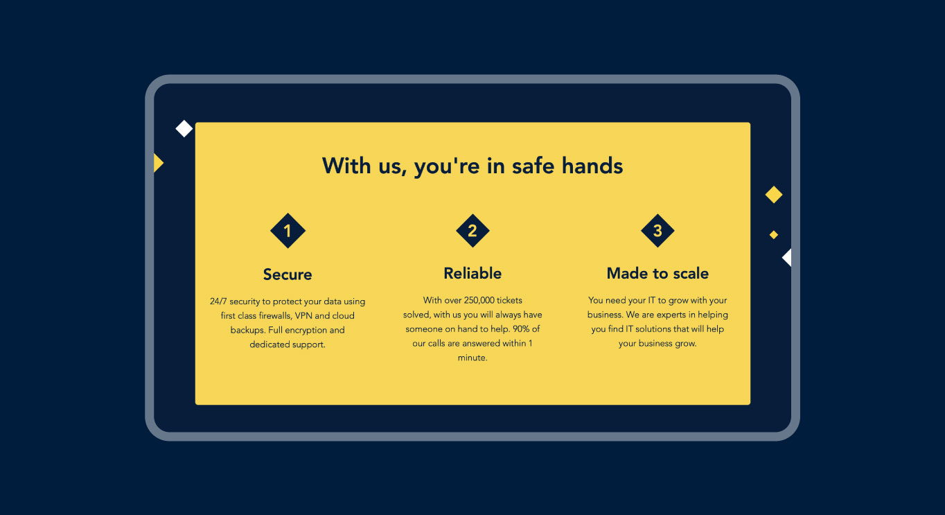
We also had a look at what presentation designs would look like so the brand had more resolution before it all went live. I wanted to give a serious corporate look and feel while finding ways to draw out the diamond shape we have used in the logo. Using these to create depth and variety on the page was the solution.
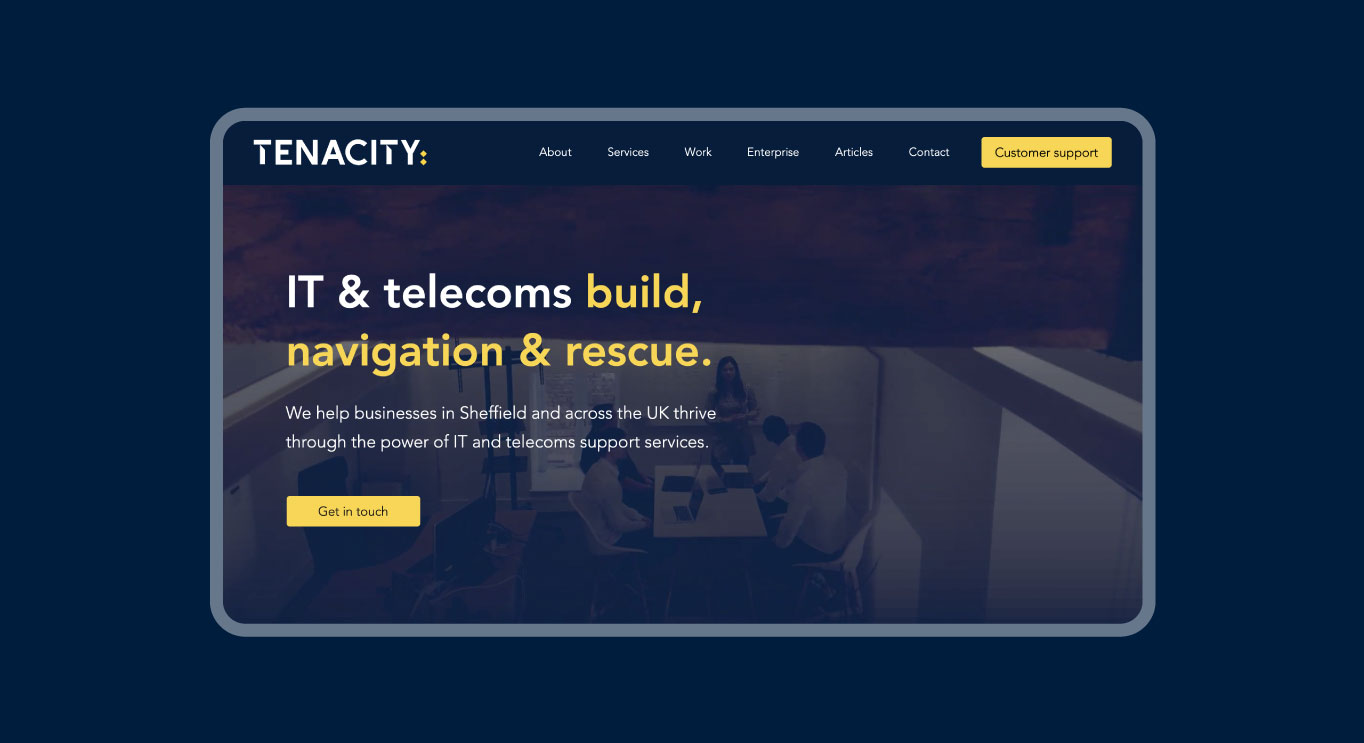
The final stage was the website design and build. As this website was mostly a brochure style site, the back end functions weren't too complex. But we wanted to make sure the site wasn't just a standard template style site. Using the platform Editor X by Wix gave, us the perfect solution of an easy to use interface while letting us build a highly customised site, take a look for yourself and view the website here: Tenacity